via the blog at everyone's favorite home-town record label, Mad Decent.
Nosing around digging for new music, I found:
the old classic (and trippy) holiday animation about a flying snowman, now with more bass.
Song can be downloaded from the comment lot on youtube.
There's also a GlitchHop version--Listen/download:
Walking in the Air (Christmas Glitch Hop / Dubstep Remix) by Retrotation
and then there's...
Also, I discovered the Depressed Buttons, kind of a twisted cross between Daft Punk and Toadally Krossed Out.
Listen. Now.
Ow! by Depressed Buttons
AutoErotique - Gladiator (Depressed Buttons Remix) by Depressed Buttons
Boys Noize - Kontact Me (Depressed Buttons Remix) by Depressed Buttons
That is all.

Wednesday, December 22, 2010
Thursday, December 16, 2010
Guest Author: Justin on TRON
I already attempted my own Tron review in the previous post, but my friend Justin is a much better writer than I am. Here's his in all it's glory, with some pictures and captions by me. Enjoy!
FUCKING TRON! :D:D:D
 |
| I want one. |
Or, "How I learned to stop worrying and love Hollywood's disgusting habit of taking some sort of cherished aspect of your childhood culture, CGI the fuck out of it, and slap a '2' at the end of the resulting movie's title."
So, being the suave and debonair man I am, I pulled a few strings (Read: I followed a viral marketing campaign that was giving out free shit by the bucket) and ended up yesterday at a free advanced screening of TRON: Legacy in Downtown Disney.
This movie has been hyped up like shit to mainstream audiences, and, well... It's made by modern-era Disney, the bastardized, corrupt, corporate shadow of a once great and mighty leader of the film industry. As such, you'd expect the movie to be a total piece of shit.
 |
| It isn't. |
I have good news for you. They outsourced it to a completely different studio. One who knows how to make FUCKING. AWESOME. MOVIES.
Any of you who lived their childhood as a DnD nerd in the 80's (Or were pitifully born in the early 90's like myself, but is still integrated enough into modern nerd culture to still be able to appreciate the nostalgic value of that time) will remember a movie called "TRON," a film about a bunch of white people on robo-togas flying lego space ships through a computer to prove that some bitch who clearly has never touched an NES in his life pirated the code for several popular video games from their original designer, Kevin Flynn. You will also remember they somehow managed to shoehorn a shitton of religious overtones into the movie, turning into a sci-fi, non-musical rendition of "What if God Was One of Us"
I can't think of a more perfect formula to create a cult-classic film, something that's absolutely horrid as a cinematic piece, yet somehow just absolutely grows on you until you come to love it. The cinematic equivalent of a puppy with a second tail for it's left hind-leg, if you will.
Well. Good news. TRON LEGACY cuts off that second tail, and equips it with a bitching cyborg leg composed of an alloy that's a composite of Daft Punk, a shitton of research into 50's-60's modernist architecture (Or so [Tyler] claims, READ HIS FUCKING BLOG ABOUT IT HERE OR I WILL SHANK YOU. EVEN IF YOU DON'T GIVE A SHIT ABOUT ARCHITECTURE. [TRON Modern] ), and... Well... This beautiful motherfucker, who absolutely did not deserve to be a degraded to a secondary character. [link]
Also included is the cutest benevolent computer glitch to ever grace a custom-built Linux-based operating system. Who also happens to somehow be the cure to cancer, SCIENCE and RELIGION. You will never want to fuck an error message more ever again. She's also got the whole "Detatched sleeves with a cute serial number tattoo peeking out" thing going on that Vocaloid seems to love, for all you anime fans out there, and even managed to work that into a major plot point. I was surprised they didn't have any Zettai Ryouki going on, either.
But anyway. Enough babbling about nerd shit. Let's talk about something all you common folk can understand: The story. I was very surprised to say that Tron somehow managed to be something that can appeal to both the cult classic nerds and the mainstream audience without making either feel like they got ripped off. Why? Because both are made entertaining by their gratuitous usage of cliche. HOWEVER. TRON: Legacy, being the pretty cool guy who doesn't afraid of anything that he is, decides to turn the whole cliche of a cliche storm on it's head, by being responsible with them. You've got twice the religious overtones Tron 1 did, you have a scene that clearly implies that the main character is symbolic of Hitler, you have cute sci-fi girls in skintight jumpsuits EVERYWHERE, you have a rebellious college dropout alchoholic main character who rides a motorcycle and goes searching for his long lost father not because he gives a a fuck (By which I mean "Pretends not to give a fuck, but clearly misses him like all shit"), but because he just happened to be in the neighborhood on the way to McDonalds. Or something.
Said anti-establishment college dropout also performs the most badass and hardboiled example of pirating an OS from a software company and uploading it to a torrent site JUST TO GIVE SAID COMPANY THE MIDDLE FINGER in the history of history. One that involved uploading the entire OS to the internet in under ten minutes, and then base jumping from a skyscraper. I guess that's more of a stereotype taken to a FUCKING BADASS extreme than it is a cliche, but the movie industry would be the best thing ever if it were to now adopt this as a cliche.
BUT ANYWAY, tacky cliche and completely unnecessary "We did this stunt because it looked cool" is indeed abound, but... Absolutely none of it is shoehorned in. It's almost bizzare. It's a two-hour long string of cliche where every cliche is undeniably essential to the plot, and where they all somehow work in synergy towards a common goal. Sure, the mysterious masked man who's been trying to kill everyone turns out to be Tron (Which should not be a spoiler, since he has TRON'S GODDAMN LOGO ON HIS SHIRT) and he has a change of heart and becomes a good guy again at the last possible minute in order to heroic sacrifice the shit out of himself (Which is a spoiler, yeah. Sorry. You should have seen it coming as soon as you realized who he was, though. Which should have been when they first released promotional art of him back when the movie was still in production), but... It's not tacky, because there's buildup to it. It doesn't come out of nowhere for the sake of "SHIT WE NEED A CONFLICT TO MAKE THE PLOT LONGER," nor is it even the main conflict to begin with. It's just something that happened, and something that HAD to happen in order for the rest of it to happen. To put it short...
It's a mainstream cult-classic well-written B-movie, with revolutionary CGI (Hint hint: The main bad guy, CLU 2.0 [Who, might I add, is based off of CLU 1.0 from Tron 1, a background character who's only named in passing and dies in the first fifteen minutes of the film. That in itself is major nerd cred.], is entirely CGI. And you don't even realize it until you start to wonder how they magically had Jeff Bridges and Jeff Bridges from 20 Years In The Past together on the same stage without a single DeLorean in sight. Look up some videos of him.) that takes a backseat to the double revolutionary set design, which most of the time is also CGI.
Yes. That statement contradicts itself on almost every level, and it should not logically exist. But it does, and therefore, is badass.
 |
| Pictured: diagrams for awesome. |
Tuesday, December 14, 2010
TRON Modern

I just got back from an epic journey by train, bus, car, and foot to Anaheim to see a pre-screening of the upcoming Tron movie. I knew it would be pretty good just from the visuals in the trailer, but I was floored by the movie itself. I could go on for a long time about everything... acting was good, costumes, sets, scenery, all excellent, plot good enough. Since this is supposed to be an architecture blog, I’ll focus mainly on the aesthetics and visuals.
This movie was excellently rendered, with visual effects that put Avatar to shame and even (dare I say it) give Inception a run for its money. I do admit, however, that I'm biased in that my favorite color combination is anything bright with black. It was imperative that this movie be rendered well in order to pull off what it wanted to, since the visual style of the movie is different from anything we’re used to. It’s an architect or designer’s fantasy- everything is superbly designed, and within a sleek, cohesive, modernism-inspired language. It reminds me less of the futures envisioned by most recent sci-fi movies, and more like the distant future as imagined in the 1950s or 60s. It is predominantly modern, with a sort of clean-industrial minimalist architecture that would make Mies Van Der Rohe very pleased. In one part of the movie, the characters are in a house that is part Farnsworth House...
This movie was excellently rendered, with visual effects that put Avatar to shame and even (dare I say it) give Inception a run for its money. I do admit, however, that I'm biased in that my favorite color combination is anything bright with black. It was imperative that this movie be rendered well in order to pull off what it wanted to, since the visual style of the movie is different from anything we’re used to. It’s an architect or designer’s fantasy- everything is superbly designed, and within a sleek, cohesive, modernism-inspired language. It reminds me less of the futures envisioned by most recent sci-fi movies, and more like the distant future as imagined in the 1950s or 60s. It is predominantly modern, with a sort of clean-industrial minimalist architecture that would make Mies Van Der Rohe very pleased. In one part of the movie, the characters are in a house that is part Farnsworth House...
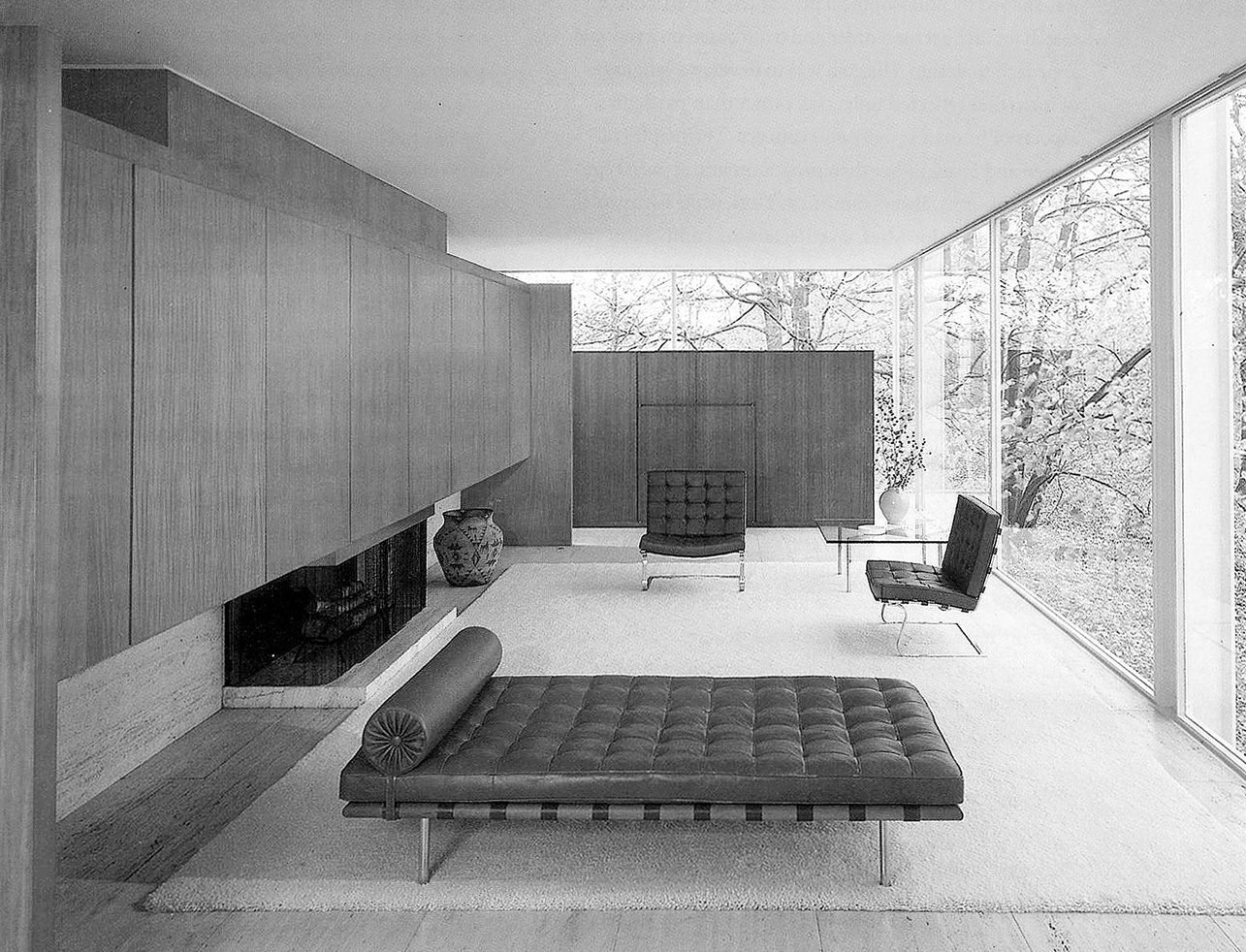
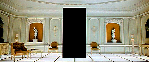
and part Barcelona Pavilion...
with a nod to the neo-baroque furnishings of the final scene of 2001...
The whole movie is sort of an action-packed ride through a creative contemporary interpretation of Modernism that does indeed do the style justice, and this is coming from someone whose whose own style is heavily influenced by modernism above all others. Finally, all the vehicles in the movie, from the light cycles and tanks to the light-jets and light-plane that make an appearance are the most ridiculously cool looking vehicles in any movie, ever. That’s tall claim, I know, but just wait and see as soon as you can on the 17th.
As usual, stay tuned for an update once I'm more alert...

Thursday, December 9, 2010
Transitional Space

This was the final project of the semester, and the first architectural environment we designed at human scale. we were given a hypothetical site 36' long by 24' wide, with a 6' by 24' by 1' plane elevated at one end of the site 8' off the ground plane. At the other end of the site, there's a large monolithic mass 18' by 18' by 6' thick.
The assignment was to design an environment that would facilitate the passage of person travelling through the space from the elevated plane through an opening in the mass, or vice versa. At first I wanted to approach the project as if I was designing a temple, a type of space that often places an emphasis on passage or transition. the problem was a church, temple, cathedral, etc, is usually symmetrical in both plan and elevation along the building's main axis. Symmetry expresses a kind of stillness or quietness that helps the space feel sacred or holy, but the symmetry trick is hard to pull off. I decided instead to do something asymmetrical, in order to make specific moments in time as one follows a path through the space become more important, and to ensure the experience of the space constantly changes as it is navigated.
 When our studio instructor was further describing the requirements for the project. I should mention here that we were also given a "kit of parts"-- specific sizes, shapes, and numbers of parts of pre-determined dimensions. Of course, the first thing we do when we get a new assignment is thoroughly read through the guidelines looking for any useful loopholes in the wording. In this case, the golden loophole was a line saying, "you may combine or divide pieces from the kit of parts so long as you use a consistent method of addition or division". At some point someone asked how we were supposed to treat the surface of the site. Our instructor told us our hypothetical people couldn't walk directly on the surface.
 "So it's like lava?"
"well, kinda--but it won't necessarily kill you..."
"So, like water then"
"Yeah, think of it as water."
So here I am, thinking "I'm building s structure to facilitate the transition of a person from a long narrow raised platform over water to some other object. I'm building a dock."
I couldn't get the dock idea out of my mind, so I went with that. My first study model was a fairly abstract interpretation of a dock (I thought) but my professor took one look at it and said "that's a dock. Make it more abstract). What I ended up doing was building something dock-like, but using a system of interlocking unit modules, that combined in different ways to form pathway-platforms. I stuck to a strict set of rules as to how I joined the modules, so that my project sort of fell into order according to the extra rules I had made for myself. This was very helpful: it's hard enough to stare at a blank 2D canvas and decide where to go, let alone a 3D one. Near the end of the project, it ended up almost designing itself, and stood by to help it decide what to do now and then. according to the architecture students' bible, 101 Things I Learned in Architecture School, "Properly gaining control of the design process tends to feel like one is losing control of the design process."
 |
| left elevation |
 |
| right elevation |
 |
| plan |
 |
| front |
 |
| back |
Saturday, December 4, 2010


Wednesday, December 1, 2010
Hard Corbusier
I came across this youtube video randomly a few days ago...it's obviously very amateur but still is fun to watch/listen to and presents some interesting ideas. We're used to hearing generic classical music in films or movies about architecture, which doesn't always actually pair well with the buildings in question, as all buildings have a very unique feeling and experience. In this case, I think the jarring bass of Dubstep is far more descriptive of the multiplicity of brutal concrete forms in this Indian compound than any classical song could be.
Subscribe to:
Comments (Atom)